Stop Starving Slides; Start Structuring
For the black-and-white Cognitive Load Theory take “Don’t put too much information on your slides,” here’s the rebuttal - don’t delete, design.

How many trees are in the first photo?

You can probably count them.
How many are in the second?

Most people stop counting and name the whole: bushland… (if you’re Australian); forest for everyone else.
What stopped you from counting all the trees? What changed? Not the trees… Your mode of seeing. Faced with a handful, you track items. Faced with dozens, your visual system flips to set perception: it compresses detail into a gist and reports “forest” rather than “tree, tree, tree…”. If our brains didn’t do this, everyday vision would be impossible, we’d be stuck tallying before we could understand.
That automatic switch is useful, but it has a cost: when detail matters, an unstructured scene collapses into “just a lot”. Slides are the same. If relationships aren’t made visible, students see a forest of information and stop counting the trees that matter.
“Use fewer items on a slide” has become a reflex in teacher CPD. It’s an understandable reading of Cognitive Load Theory: cut everything extraneous that might distract the novice. Helpful sometimes, but incomplete. When you strip a slide to near-blank, students must carry the structure of everything you’ve taught so far in working memory. The screen is idle and the mind does the layout work for the concept being taught. A better rule is this: let the screen carry the structure so the learner can think about the idea without being overwhelmed.
I first encountered this way of thinking in Borries Schwesinger’s The Form Book (thanks to Oli Caviglioli, who casually introduced it to me on X). The book is about forms… The humble documents people fill in every day.

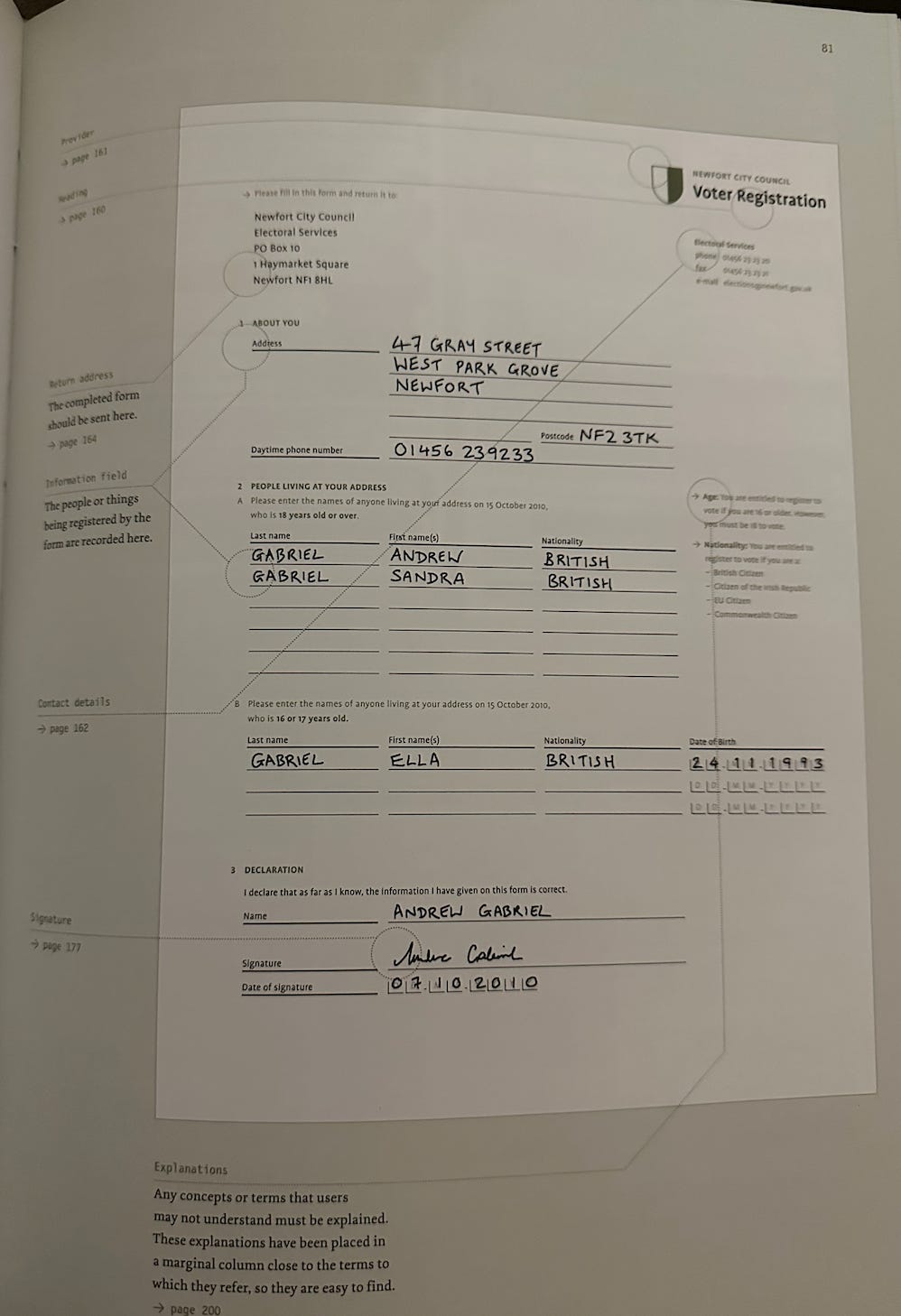
This 324-page monster explores every imaginable detail of what makes a form work, or fail. Forms live or die by whether a tired person can grasp the structure at a glance. It turns out that’s a pretty useful rule for designing lessons in PowerPoint, too.
The penny drop from The Form Book was simple: my slide deck is an on-screen form. Pupils are filling it with attention, not biro. When the structure is legible, they can spend energy on the idea. The book also mentions the rules of Gestalt.
Gestalt principles that make slides teach
When we build lessons in PowerPoint, we often focus on content: definitions, examples, images, steps etc. But learners don’t absorb information one bullet point at a time. Their brains look for patterns, structure, and relationships. That’s where Gestalt principles help.
Gestalt psychology is based on the idea that the mind organises sensations into coherent wholes: the whole is different other than the sum of its parts. We don’t just register bits; we instantly group them into patterns, objects, and scenes.
Teachers can utilise the following Gestalt principles. In practice, students automatically group nearby and similar items, complete bounded shapes, and look first at what is largest or most contrasting before even reading the content. Use those defaults carefully, and you can place more on a slide without adding load.
Let’s explore how some key principles of Gestalt applies to effective lesson design in PowerPoint.
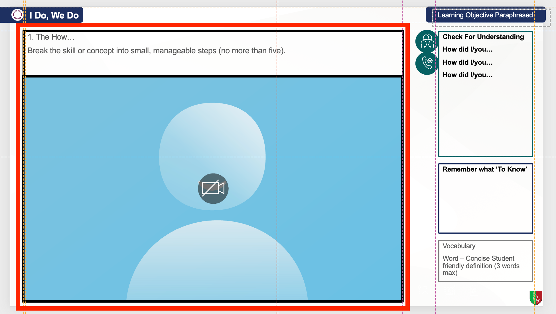
Figure–ground
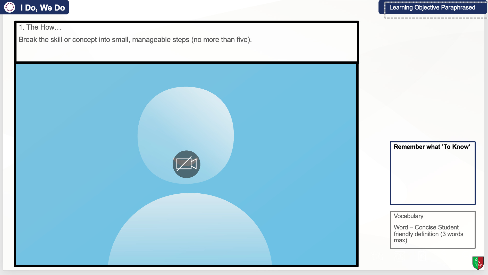
What it is: Your visual system separates a scene into a figure to attend to and a ground to ignore. The figure is perceived as in front, shaped, and meaningful. The ground recedes.
How the brain decides: Strong contrast, size, enclosure (boxes, borders), isolation (whitespace), orientation, motion, and faces pull an element into figure. If cues are weak or shared, figure and ground flip or feel noisy.

Here the visualiser space is a single stage (grounded by its border), and the white cards to the right dissolve into the background. When the visualiser plays, the border, spacing, and contrast keep the figure distinct. The side content stays easy to parse until prompted to attend to it.
Proximity
What it is: Your visual system treats elements that are near each other as one group; bigger gaps signal separate chunks.
How the brain decides: Smaller inside gaps than outside gaps → group. Alignment strengthens it. Enclosure/connection (boxes, lines) can override distance.
More than blank space. The wide blank strip (the gutter) deliberately separates the visualiser space from the right-hand panel, telling the learner’s eye “two regions”. The region on the right being an area to scaffold or to question what’s happening in the region to the left.
Tight, equal gaps inside each region signal belonging (the steps hug the visualiser). Clear grouping tells pupils those steps belong to what they’ll see in the visualiser.
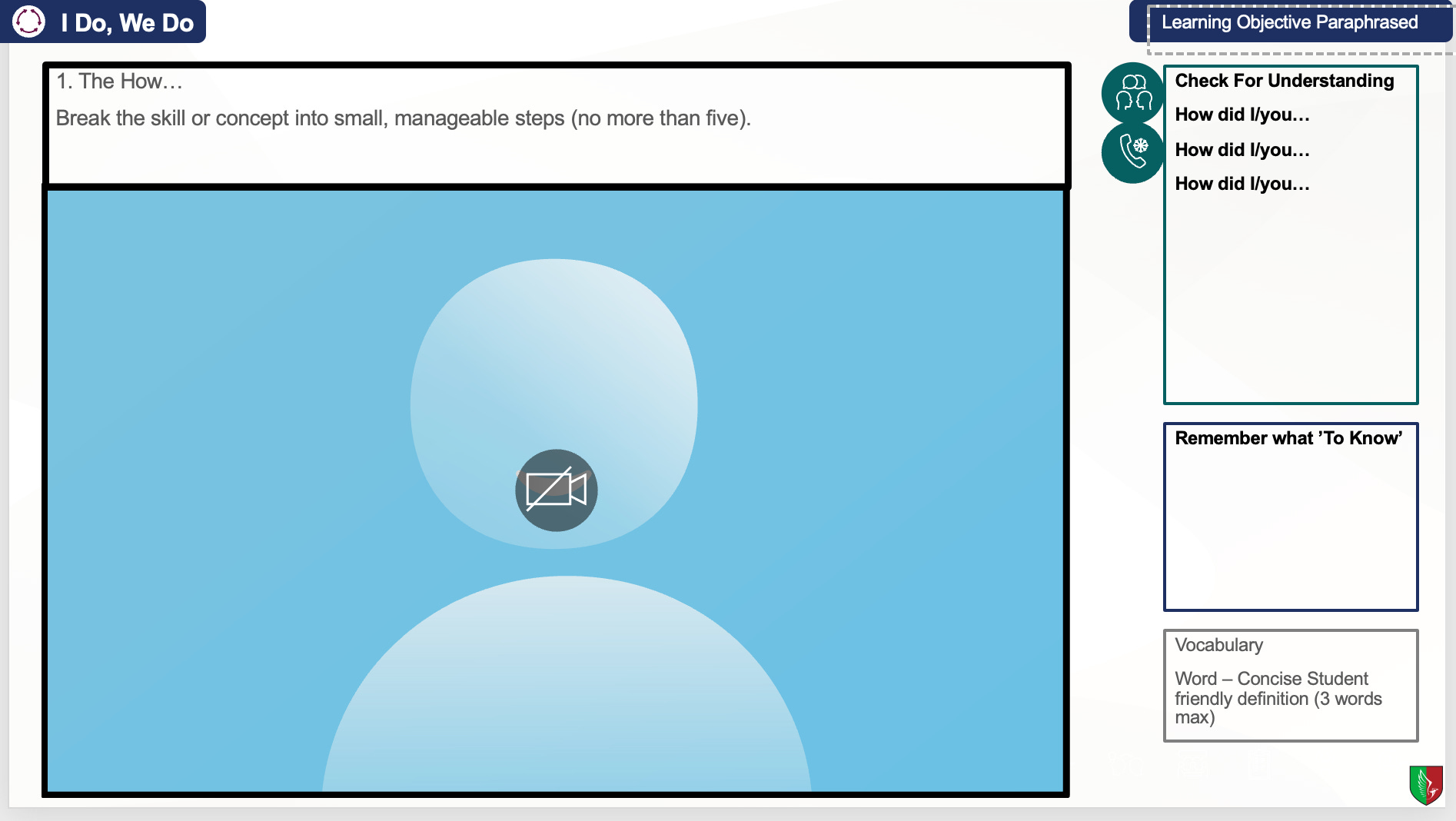
Common region
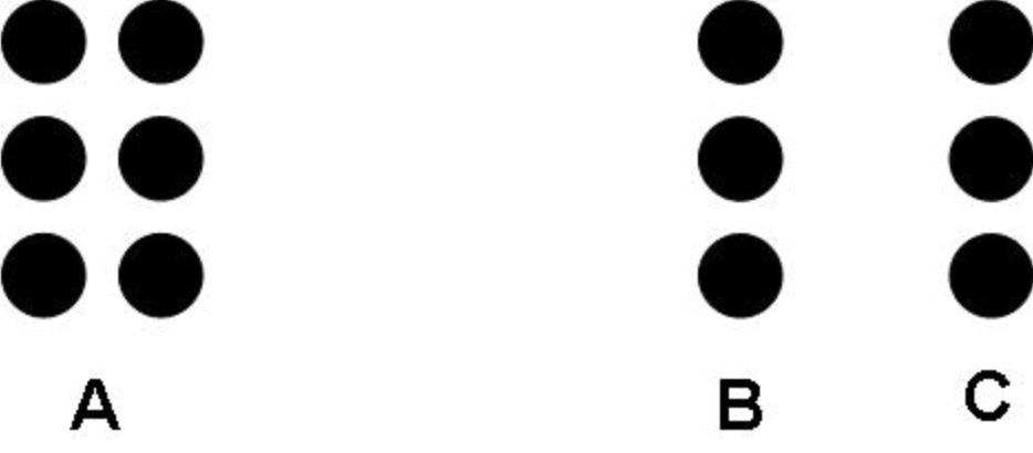
What it is: Your visual system groups elements that share a single enclosed region, a box, border, or uniform background.
How the brain decides: A closed, high-contrast boundary acts like a container; anything inside is “one group,” even if the things inside the container are spaced apart. If the boundary is faint or open, the effect weakens and proximity starts to dominate.
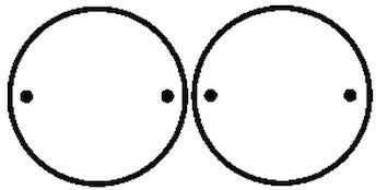
Notice that the smaller dots are enclosed by the larger circles. Even if those two dots in the middle are close to each other, we know that they don’t belong to each other due to the circles enclosing them into seperate groups.
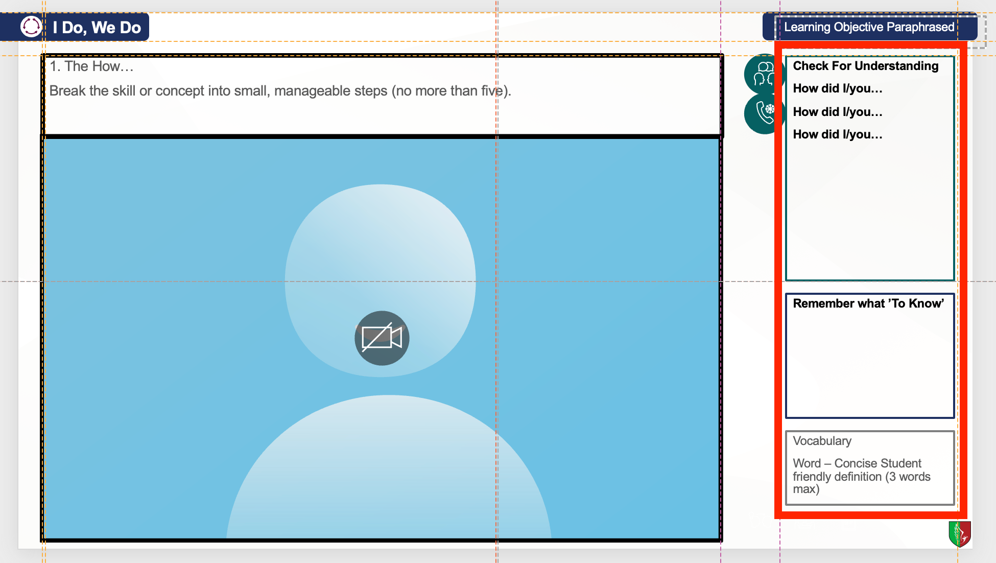
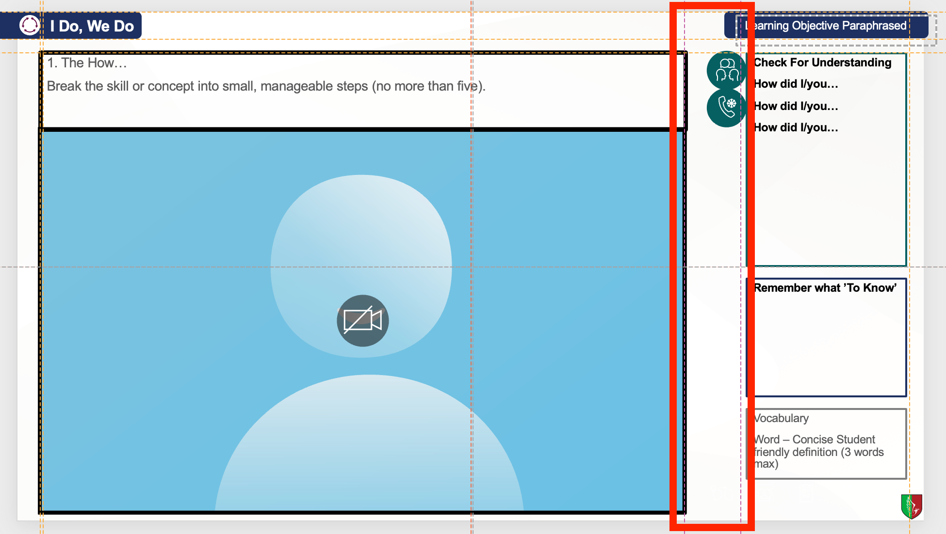
Here I am able to have CFU, a prompt, and vocabulary definitions tightly packed next to each other, but because they have defining boundaries, they can be seen as separate. Colour is not even necessary here because the solid boundaries do the work.
I’ve only mentioned a selection of Gestalt principles; even so, they explain why tidy alignment and clear grouping do more for understanding than simply deleting content, they let the screen carry relationships so working memory is spared the search.
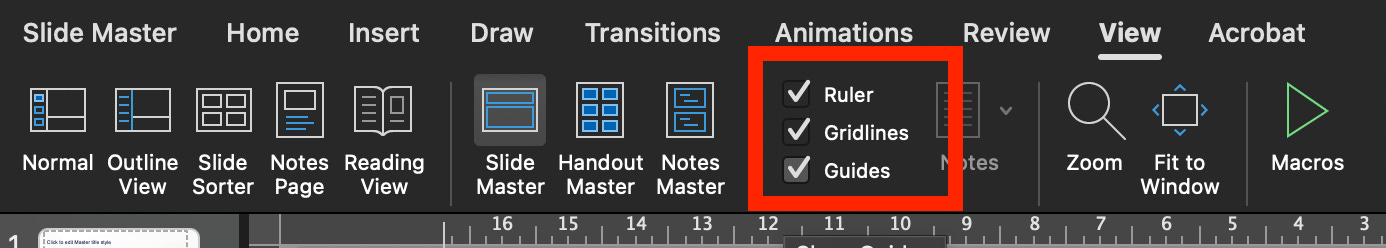
Use a grid when planning, not presenting
I’m not telling you where to park every box. PowerPoint’s underused tool is the guides. A planning aid that keeps spacing and alignment consistent. Pupils never see the gridlines in presentation mode. They’re for you, so relationships stay stable and pupils don’t spend attention on way-finding.
Planning principles I keep, whatever the lesson:
Stable anchors. Choose a couple of regions that rarely move. For example, the learning goal, a definition, and the check-for-understanding area. Stability lets latecomers re-enter without asking where they are.
Predictable lanes and gutters. Keep spacing consistent. Equal gaps quietly signal what belongs together and what is separate.
Labels live inside things. Names sit in the regions they name. Lines and light boxes beat arrows.
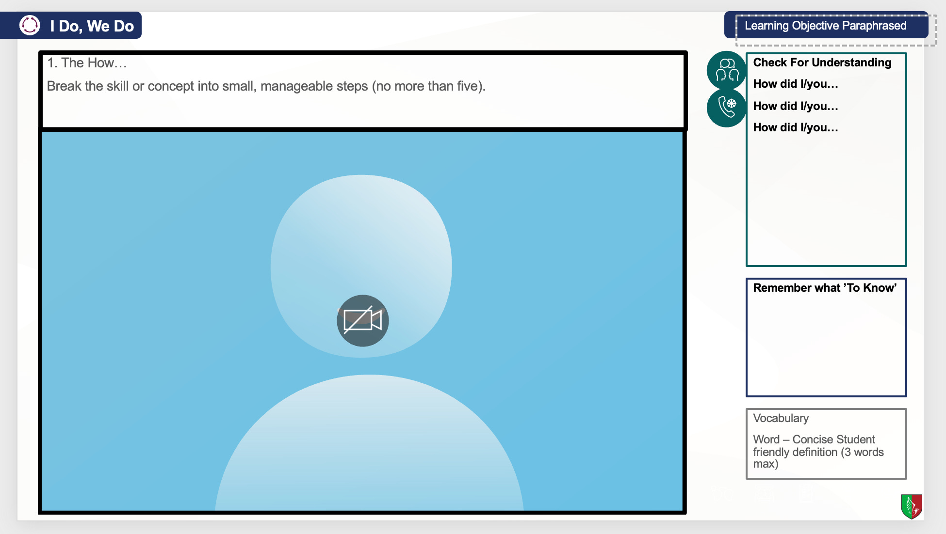
Reveal inside a steady frame. Use the simplest Appear animation, one region at a time. The map stays put and only the idea develops. For example. CFU box always appears right at the end of modelling:
That is it. Where you place content is a design choice. These rules keep the reading effortless.
When less is more
Delete anything that has no job… Decorative images, duplicate labels, fiddly animations. Minimal slides help when the teacher’s narration needs to lead, or when pupils aren’t yet decoding text; in those cases, walls of words are pointless.
In the end, the aim isn’t austerity; it’s legibility. Strip what has no job, yes, but give the map a frame. Make figure and ground unambiguous, keep gaps meaningful, put labels where they live, and reveal ideas inside a steady layout. That way the screen carries the relationships and working memory carries the concept.
Students don’t need emptier slides; they need visible structure. Make the forest legible so the trees that matter can be counted. Stop starving slides; start structuring.
Love this! Question: those principles would apply to booklet design, correct?
Do you have an example.
Also, folks can go to Master slides and design their own layouts. Alternatively, I keep a Master Slide deck. You can slide the thumbnail over to a new presentation.